
The design of good user interfaces for graphical applications is a science, and in fact also a field of research. While none of us at Symbolibre specialize in that field, we spend a lot of time trying to make our applications more usable and intuitive by means of the user interface. In this article, I'd like to explore a practical design situation: function keys and the catalog.
Understanding the path to each action
The first version of the Symbolibre keyboard looked like this: four rows of numerical input at the bottom, then two rows of math input and a row for programming. Finally control and directional keys.
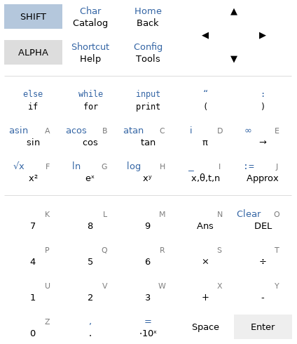 Keyboard layout for the first Symbolibre prototype.
This keyboard was inspired by the layouts of CASIO (which I am the most familiar with) and Numworks (which is essentially a simplification on the design by CASIO). The goal was to keep it simple to not overwhelm users with features that don't need to be directly on the keyboard, so the alphabetic input mode (the labels in gray that are input by pressing ALPHA) was limited to letters only, and the lowest third has a minimal amount of secondary functions (in some later designs it has none).
We can compare this to the denser layout of the CASIO Graph 75+E, which has many more secondary functions. All of them are useful, but in my opinion not to the point that they need to be directly accessible on the keyboard.
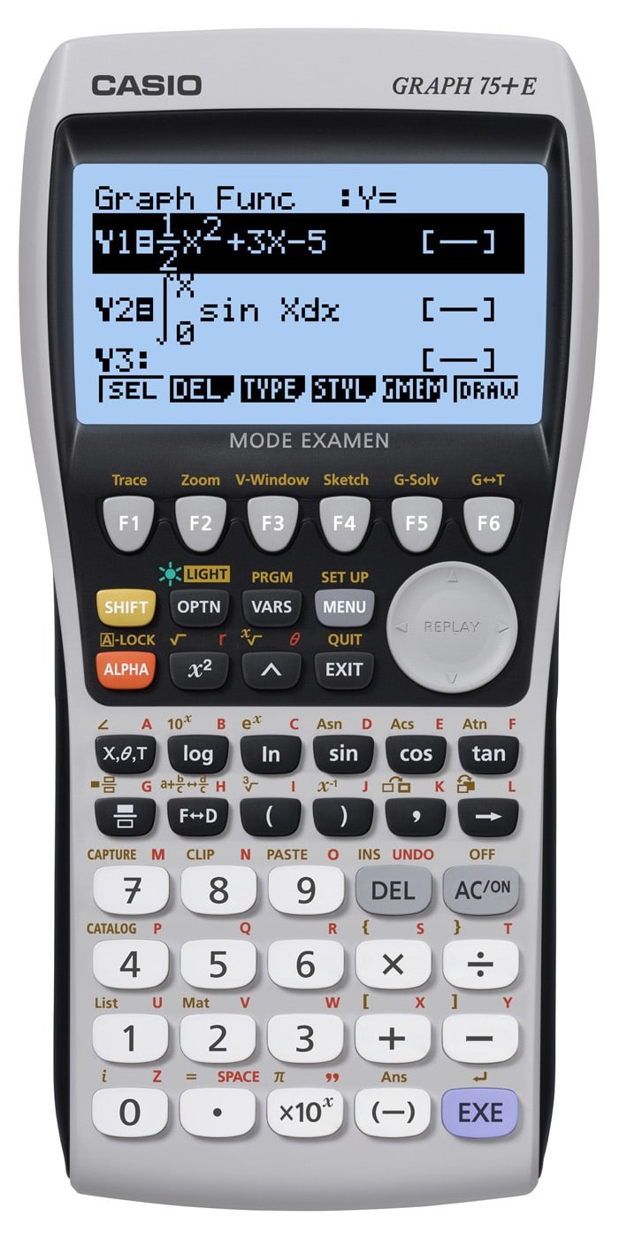 This generic layout has been used by the whole CASIO Graph series.
The reason why direct access is a concern is because of how long it takes to input a certain character or access a certain function. It is natural for common functions to be accessed through a short sequence of keys, while it is more useful for complex and less-used functions to be accessed through an organized interface.
The sequence of keys or menus that need to be browsed to perform a certain action is what I like to call the path to this action. Some characteristics of a good assignment of paths to actions are rather intuitive:
- We like paths that are short because it makes performing the actions faster. This is more important for commonly-used actions because the time save adds up.
- We like paths that are clear, in the sense that a user trying to perform a fixed action can deduce each step from the target action without exploring different paths.
- And ultimately organizing features is a matter of personal preference, so we like paths that can be customized to some extent.
Obviously the rather large amount of mathematical and programming functions on a CAS graphing calculator means that not all features can be accessed with a single method, so a good design will need to balance these factors to be effective for different uses and different classes of users.
Problems with our initial design
The bottom two regions of our keyboard were (and still are) dedicated to numerical, math and programming input with a fixed set of functions. This means that anything else has to go through the "control" region at the top.
The first keyboard design tried to keep a semantic label on each control key to ensure that the role of the key stayed consistent throughout the applications:
- Catalog and Char were meant to input arbitrary functions and characters through a menu.
- Back and Home were meant to navigate menus and applications.
- Help is for contextual help.
- Shortcut was an attempt at providing direct-access shortcuts.
- Config and Tools would access application-independent features such as angle mode settings.
The most straightforward problem with this layout is that every symbol not on the keyboard (such as a definite integral) had to be input through Catalog and every application functionality (such as a graphical solve in the plotting application) had to go through Tools.
This means that almost every path starts with a key press that carries little to no information on what action the user wants to perform, which I like to see as a waste of user effort to emphasize the fact that a good user interface conveys a maximum amount of intent in every interaction.
But more importantly, the user is not presented with any hint about the available interactive features (zooming in on a plot, graphical solves, etc) until they open the corresponding menu. Menus also do not typically distinguish basic and advanced features, which makes it easier to get lost.
I tried to salvage this design by suggesting more specific labels such as Details, Options, Tools, Customize or Actions, but these were even worse because they violated the clarity required for paths: there is no way to intuitively tell in which menu a chosen action would be because almost every menu fits every action.
The Shortcut key was also ironically hidden behind a SHIFT key press (since it was the secondary function for Help), which adds a meaning-free keyboard interaction to actions that are supposed to be readily accessible. 😅
The main paradigm shift between this initial design and the new function-key one is to allow keys to have context-dependent meanings.
Function keys
Function keys are a set of numbered keys (in our case, F1...F5) with context-dependent meaning. The meaning is expressed on a function key bar at the bottom of the screen, just above the keys.
 The labels on the function bar are lined up with the F1...F5 keys on the keyboard.
This idea is not new at all, in fact CASIO has been using it for years. But the way we use function keys to build our interface differs in a couple of ways.
The CASIO Graph series relies on function keys for both input and access to interactive features. The keys form a tree of menus and actions, starting either from fixed keys such as VARS or its secondary function PRGM, or from context-dependent F1...F6 keys themselves.
For instance, the path for the Locate command used in Basic programming to print text anywhere on the screen is PRGM → I/O → Locate. PRGM is a secondary function so we need to press SHIFT to access it. Additionally, it has more than 6 categories, so it's split into pages that can be cycled with F6. I/O is on the second page, so we end up with a 5-key sequence:
- First,
SHIFTandVARSto open up the programming menu. - Then,
F6to navigate to the second page andF4to open theI/Ocategory. - Finally,
F1to in put theLocatecommand into the program.
This might look like a lot, but it's fairly efficient. The command prints 7 characters so it's definitely faster than typing all the letters, and enthusiastic programmers often rely on muscle memory to input it in less than a second.
 Path to the
 Locate command in CASIO's Basic program editor.
I'd argue that the problem with this design is not in the length of the paths, but their clarity (or lack thereof). There are a lot of entry points into the menu system, including three fixed keys (OPTN, VARS and PRGM) and many context-dependent others (such as the F4 key MENU and the secondary F2 ZOOM, F3 V-WIN and F4 SKTCH keys in the program editor, all of which can be seen on the previous animation). Some have a lot of categories (OPTN has 16), and the menus are pretty deep, with commonly 3 or 4 levels.
Additionally, the small screen size (128×64) makes it really hard to write clear labels. The designs are good, but short forms of English words do not resonate as readable to foreign students and make it very hard for new users to find their way to pretty much any function.
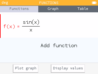
Symbolibre only uses function keys to provide context-dependent meaning, so that pressing one of the F1...F5 keys conveys more intent than pressing a generic key such as Tools. Here in the Graph applications, the F4 key can bring up the window settings in one hit.
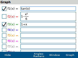 The window range popup mapped on the F4 key in the plotting application.
This avoids one key press, in addition to visually presenting the user with the most important functions to help new users find their way to basic mechanisms. This advantage would be lost if everything were grouped under Tools.
We do not use nested menus in this form because of the problems found with CASIO's design. Instead, we rely on full-screen popups such as the catalog, that display full names and descriptions while still enabling muscle memory (more on that later).
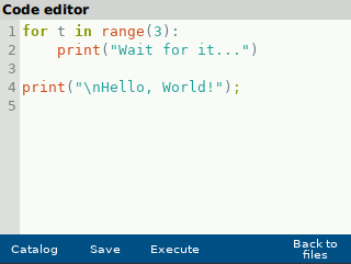
A consequence of this catalog design is that it would be more awkward to open directly in a submenu, so we still group all non-direct input behind the catalog key (which is F1). At least the catalog is now context-dependent, which helps shorten selections. The animation below shows the Python catalog being used while editing an example Python script.
 Browsing the Python catalog in the IDE.
Navigating with function keys
Writing formulas, code, and performing interactive actions are not the only common key sequences in a graphical interface. There is also navigation, whether it is between applications, between different screens in a single application, or even inside a dialog or a menu.
I believe there is a notable difference between navigation and function input, which is seeing the big picture. When browsing a menu to find the Locate command, the user doesn't need to have a bird's-eye view of what exists in the menus and where things are located: it is enough to determine where Locate is while ignoring the rest.
However, it is important for an application to have unambiguous screen names and navigation methods, so that the user knows where they are and how the current screen fits into the application as a whole. Numworks does this very cleanly by using tabs, which shows the names of all screens at all times.
 Numworks uses tabs to organize their user interface.
The drawback of tabs it that the user needs to move the cursor to focus the tab bar before switching screens, which takes a variable and sometimes long sequence of inputs.
We've been experimenting with navigation options that use the function bar, as can be seen in the plotting application that switches between function definition and plots with F5.
There is always the risk of fitting too much into the generic model, with a result that lacks structure and consistency, so we'll have to see how we organize function keys in the future. We have planned, but not yet implemented, different styles of function keys for different types of actions; this can include color changes for navigations keys or a "..." suffix for keys that open dialogs. We'll see how it turns out in the next release!
Menu designs
Before wrapping up this article, I would like to mention the design of menus and catalogs, since there are so many options. The bare-bones method of organizing the menus is a simple alphabetic listing of all options, like the original catalog by CASIO.
 CASIO's alphabetic catalog with a category filter.
This is arguably very hard to use, with a large amount of unknown or never-used functions mixed with the most common ones. Further versions have added a category filter and most recently an interactive text filter, which is the easiest method to locate predetermined functions. z80-based TI models also have a simple alphabetic catalog, but there are several entry points through specialized keys like MATH, LIST or PRGM.
A different, hierarchical approach can be found in the contextual menus of the HP Prime, which features categorized information and keypad shortcuts.
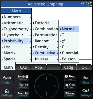 Contextual menus with numeric keypad shortcuts on the HP Prime.
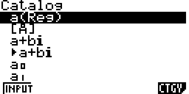
This is the inspiration for our catalog, where digits can be used to select entries quickly. For instance, the from math import * statement can be pulled from the catalog by selecting the Import category (by typing 0) then math (by typing 3).
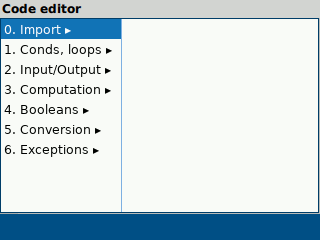 The path to
 from math import * is F1, 0, 3.
The hope is to replicate the usability of both CASIO's function key menus and HP's contextual menus with numeric keys, without sacrificing the ability to present detailed information about the functions and their role while browsing.
Conclusion
Functions keys are used in the Symbolibre applications to present the user with context-sensitive actions that are more meaningful than fixed key labels, and to help organize functions by putting commonly-used actions forward and more advanced ones in menus.
This ties with the design of hierarchical menus and particularly the input catalog, which need to be both informative for new users and efficient to use for experienced ones.
The design of graphical interfaces that are accessible to a wide range of users is certainly a difficult task, but we hope that these considerations and choices bring our Symbolibre applications closer to this objective.
Submit a comment
Comments are reviewed manually to filter out spam.