As part of the development of our calculator, a poll has been set up for high school students and shared with a few math teachers around Lyon. The goal was to determine the common problems met by students when using their calculators. We got more than a hundred answers, so we can draw pretty reliable conclusions on the challenges the Symbolibre calculator has to address. The screenshots are in French, the translation of the questions is provided below ("oui" is "yes"). Without further ado, let’s see the results!
Poll results
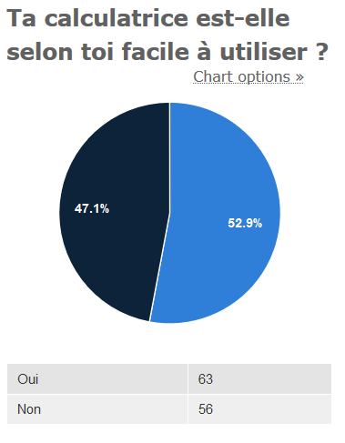
- Do you find your calculator easy to use?
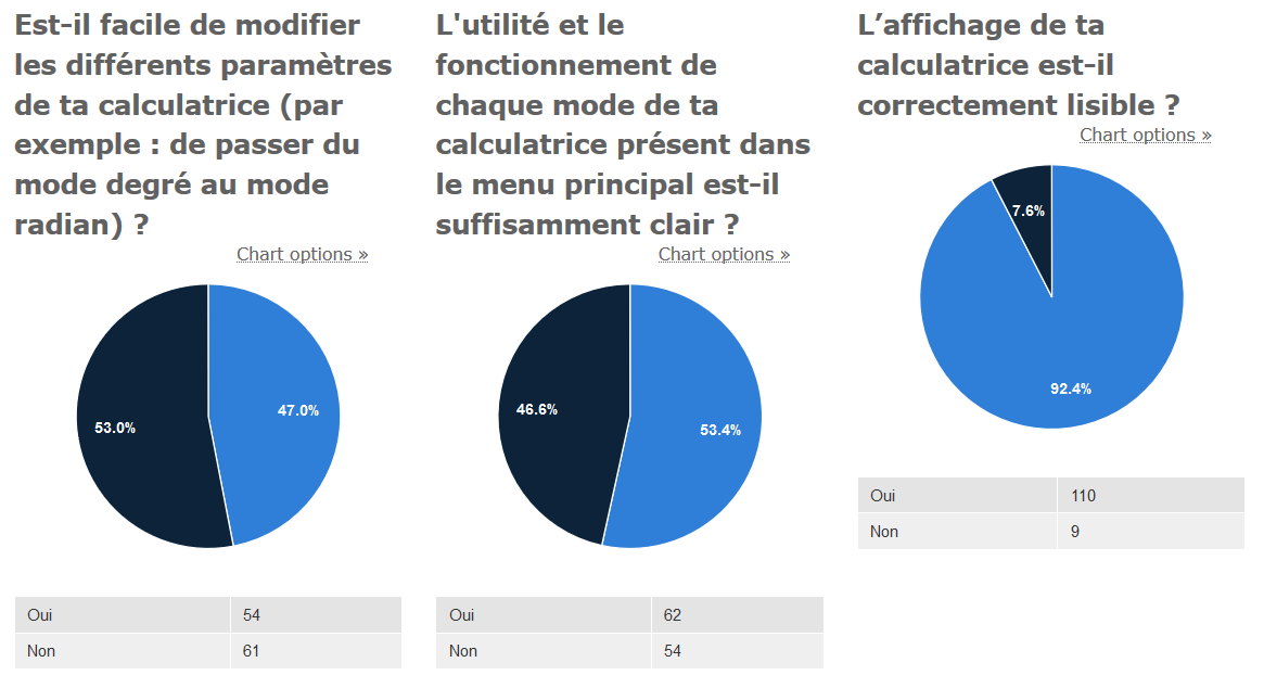
- Is it easy to change the configuration (ie. switch from degrees to radians)?
- Is the role and behaviour of each mode of the main menu clear?
- Is the display easy to read?
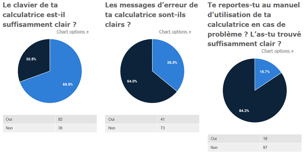
- Is the keyboard clear enough?
- Are error messages clear enough?
- Do you ever refer to the user manual to solve issues with your calculator?
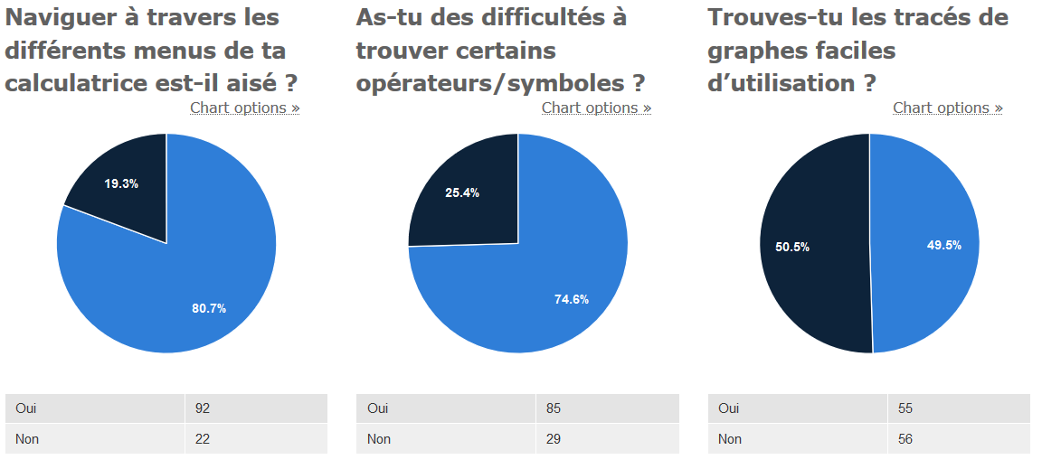
- Is it easy to navigate through menus?
- Do you have any difficulty finding some symbols or operators?
- Do you find graphs easy to use?
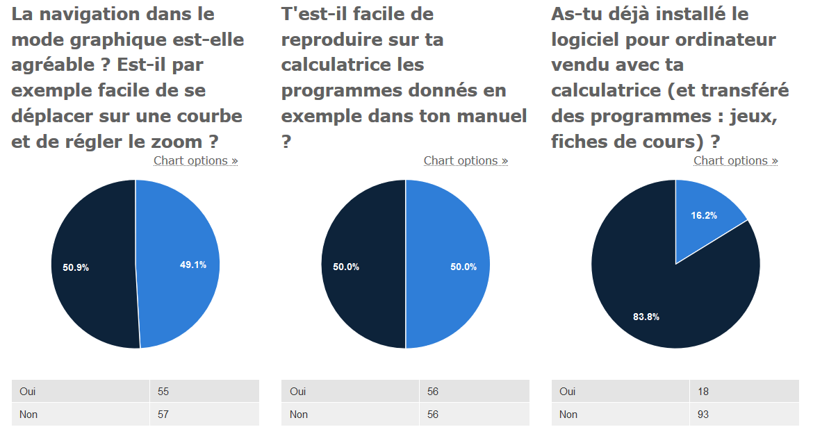
- Can you easily navigate the graph, change the window and the zoom?
- Can you easily input programs from the textbook into the calculator?
- Did you ever install the computer software and transfer course notes or games to your calculator?
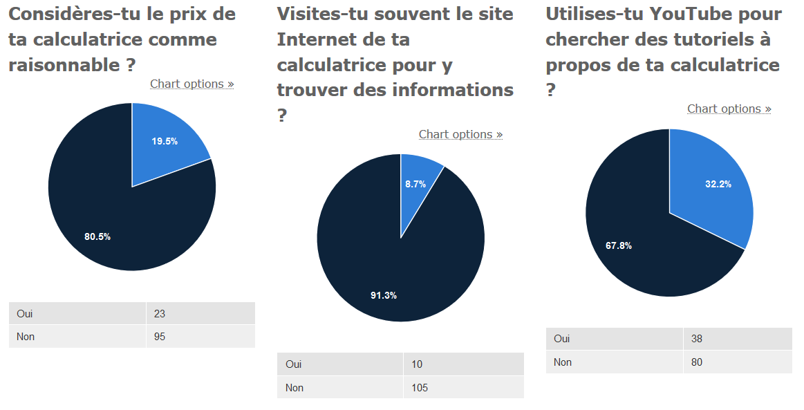
- Do you think the price of your calculator is reasonable?
- Do you visit the calculator’s information website?
- Do you use YouTube to find tutorials or help?
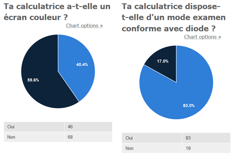
- Is there a color screen on your calculator?
- Is there an examination mode with a blinking LED?
What conclusions can we draw?
It’s first apparent that few good points are raised by the students. Apart from having a readable display, none of the aspects we suggested reach a general satisfaction. There are even agreements on bad behaviour of features. Let’s see what we can hope to improve with the Symbolibre calculator:
- Unclear settings and navigation methods. There seems to be some room for improvement in terms of global organization. We hope to build intuitive GUIs with common elements to make the machine easy to control.
- Half of the students seem to have difficulties using the graph, one of the most used applications in high-school. Programming doesn’t shine either; we don’t think it is normal that applications highlighted in high schools programs are this hard to use, even when it’s just about copying examples from schoolbooks.
- When problems arise, finding solutions is also a problem in itself: an overwhelming majority of the participants declare not using the user manual. The main reason cited in the free remarks field is definitely its discouraging length. To this we can provide only a general user guide as a manual and document the rest in an easy-to-browse web interface. We also wish build help wizards in the system.
- Among other free remarks at the end of the form, many students say they have difficulty finding the operators that they want to insert, sometimes on the keyboard, sometimes hidden deep inside insertion menus. We’re designing a straightforward keyboard with built-in insertion keys and the possibility to configure custom shortcuts to reach operators fast.
- Finally, students perceive the sheer price of their calculator the same way we do. With Symbolibre, we wish to show that modern hardware is more affordable than modern graphing calculators.
As you can see, there’s a lot of work to do. We’ll leave it up to you to evaluate our contribution to these aspects!

Submit a comment
Comments are reviewed manually to filter out spam.